Mysterious New NBCSN Graphics Roundup
On Friday, December 5th, NBCSN broadcast an interesting College Hockey matchup between #17 Boston College and the University of New Hampshire. As an avid College Hockey fan, I was looking forward to the broadcast, hoping for some nice BC schadenfreude, or at the very least, some solid Hockey East action. What I got was something altogether unexpected and magnificent!
NBCSN has used the same graphical theme since their inception from the ashes of the Versus channel in January 2012. But that changed this past Friday, when something totally different was rolled out for what should have been a routine College Hockey broadcast!

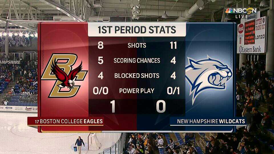
What is this new devilry? The chrome, heavily gradiented graphics of old are gone, replaced with a more flat, light-colored theme. There’s definitely still some 3D depth — sort of a chiclet look. I was left wondering… why? The NBCSN College Hockey broadcast the next day (Saturday 12/6) was a revision to the norm (which I also grabbed a bunch of screenshots from, but if you know my blogging style at all, you know you’ll never see them). My leading thought right now is that this a trial of the look that NBC will debut at this year’s Super Bowl. Right now, the Big 3 (NBC, CBS, FOX) rotate through the Super Bowl. Last year’s Fox broadcast didn’t really debut anything new, but 2013’s CBS broadcast was the debut of the new look and feel that continues to all CBS and CBSSN broadcasts to date. Seems like a opportunity for NBC to change up their look too!
My other theory is that somehow the production truck was ill-equipped to use the normal NBCSN graphics for whatever reason, but seeing that there was another broadcast on Saturday presumably using the same truck (from Lowell, MA, a journey of all of 57 miles) seems to negate that possibility.
So, systems test will be the prevailing theory! So let’s take a look at NBCSN’s new look. As a reminder for those of you new to this series, these screenshots are taken directly off my TV using a bizarre LG app. The app unfortunately only takes screenshots at 960×540 with high levels of JPEG compression. It’s the best I can do until I finally call Comcast and ask for a cable card. Which I should do. But not today.
Click through the “More” link to see this graphics roundup in full.
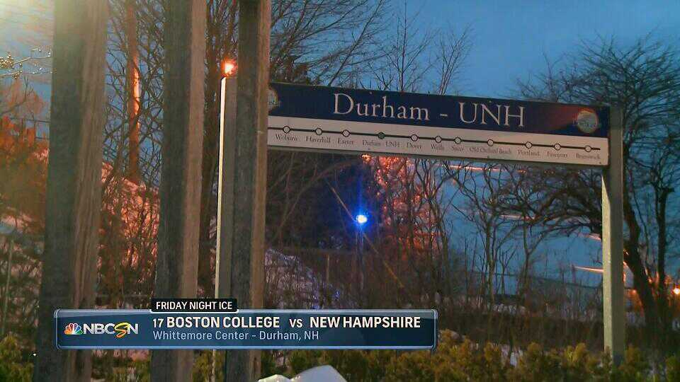
Here we go! The UNH Wildcats play in the Whittemore Center in Durham, which a little Wikipediaing tells me seats 6,501 and features an Olympic sized 200×100 ice sheet–the widest in the Hockey East conference (though several others boast 95′ wide rinks).
This opening graphic offers all the important details–matchup, USCHO rank, branding (both logo and “Friday Night Ice”), and location. The way the sub-title slots in to the top of the graphic is nice. The shot is… well not the best exterior shot I’ve seen leading in to a broadcast–I can gather from this shot that Durham – UNH is the 5th-to-last (or 5th-to-first?) stop on some sort of transit line. The shot does little to establish the campus, rink, or city environment. Subsequent googling revealed that the Durham-UNH station is in fact the 4th northboard station of the Amtrak Downeaster.

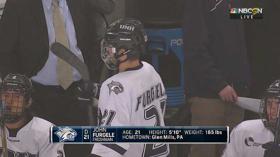
During the pre-intro sequence, we see the typical locker-room scenes. This graphic is short on details, but that’s fine for a pre-intro montage. Note the logo, position, number, and name. The name is rendered in all caps, with the last name in bold. The graphic itself features UNH’s primary color (listed on Wikipedia as “UNH Blue”……) as the background, with white accents along the sides and bottom.

Thatcher Demko, BC’s star goaltender and one of three goalies on the 2014-15 USA U20 WJC roster, is pictured here juggling against a wall (?). His graphic reveals a couple more details about the graphics theme–the school’s secondary color is used on the bottom of each graphic. The sides of the graphic appear to use the school’s primary color and a gray/silver vertical piece.
Here, again, is the opening graphic. Once again, we get branding (Friday Night Ice), schools, location, etc.. The school’s colors are again apparent, although UNH’s secondary silver/white color blends in the graphic compared to BC’s gold. We also see a bit more of a curve in the bookends/sides, and this time the primary color is not apparent outside the bookends. We see a bit of NBC’s famous peacock logo adorning the background, as well as a somewhat strange upward diagonal accent line from the bottom of the B in BC to the top of the Wildcat’s nose. In terms of content, only overall records are displayed–it’s sometimes a bit more valuable to also show in-conference matchups. No clarificationover whether this is a Hockey Easy contest or not (it is). I like the use of (presumably) small caps in the 17 used to designate BC’s USCHO rank. All Caps are somewhat unfortunate, but seem to be a carry-over from the SD era. In my opinion, the clarity of HD screens now allows for mixed case title rendering, which is generally regarded as easier to read given sufficient clarity. Perhaps there’s an argument to be made when these TV broadcasts are streamed online, but I digress.
Also, what is this shot? Maybe there was a good reason they showed the train station earlier in the broadcast! Beats a solid black sky!

Welcome hosts DAN PARKHURST and KEN HODGE. All details of the NBCSN branding are apparent–logo, multiple peacocks, and colors. Light blue adorns the bottom edge, rather than the chrome seen on the sides. These lower thirds have a pleasant 3D depth owing to the bevel on the top and left/right edges.

Unfortunately, the graphics look is inconsistent. The pre-baked transition graphics are from the “old-style” glass look. I still love this style, but wish they had gone entirely in one direction or the other.
Here we get our first look at a player lower 3rd. The “Career” ascender seems a bit out-of-place, but otherwise this is a pretty solid graphic. Would like to see the inclusion of PIM and +/-. Framing on this shot is awful.

As we approach the end of the pre-game, pre-first-commercial-break segment, we’re treated to a hype graphic, as if we haven’t seen this information already. Nice shot, though.

Heading in to the break, we’re treated to the old/standard Friday Night Ice sequence. This graphic doesn’t match the old or new theme.

Returning from commercial, once again trains stations are the main thematic element. I have never been to Durham, but is there really no better establishing shot of campus/the city?!? This is a new graphic, though it looks similar to the sponsor billboard used in the current suite. The NBCSN logo was shortly replaced by sponsors (two, if I recall).
Many of my screenshots catch the subject with their eyes closed. I’m not sure why this is, but I can’t be bothered to retake this screenshots. The content of this graphic is rendered in mixed case, thank goodness.
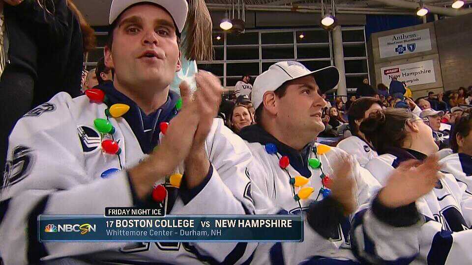
This is the same graphic as the first one, but I enjoyed the lights these fans were sporting, so it gets included again. Good bump shot.

Alright! We’re now post-anthem, pre-puckdrop, so it’s time for the goalie stats! Here’s another look at Mr. Demko, who is no longer juggling tennis balls. All important goalie stats are covered.

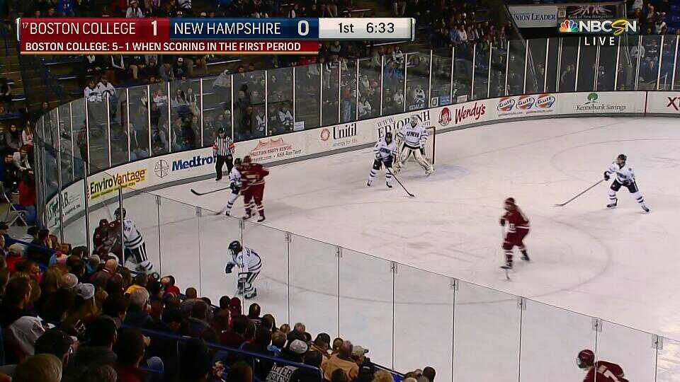
Adam Clark’s shot is framed looser. This is also our first shot of the ice, which reveals a rather warm color temperature. Contrast the red of the ice with the white of the jersey. Now, ice white and jersey white will never match, but the ice looks particularly red/warm throughout NBC’s broadcast.

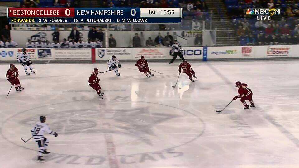
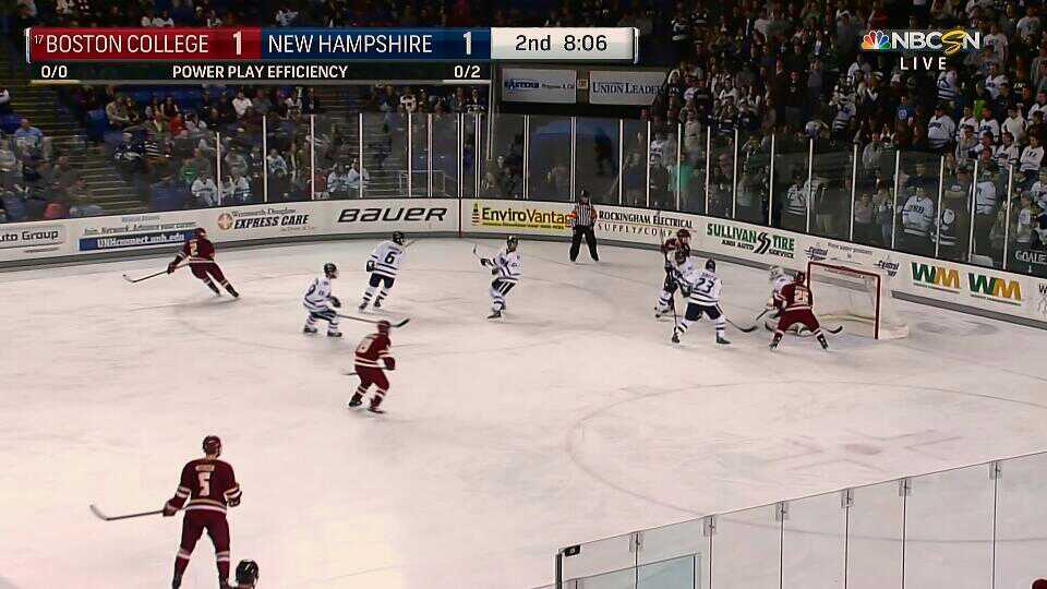
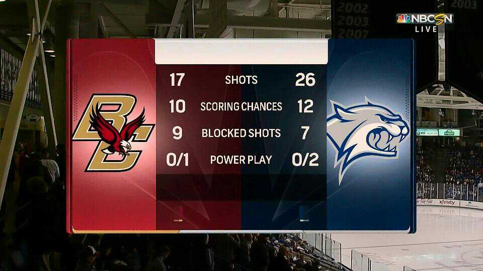
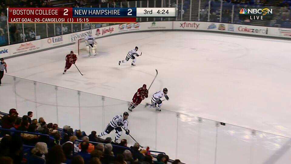
Here we go! After the puck drop, the score bug/bar appears, and wow! Tons of stuff to cover. First of all, it’s not centered. This is a trend that the various CSN-City stations have been using over the past couple seasons during their NHL broadcasts, but NBCSN never adopted for their national broadcasts. The team names are rendered in full, which I am a big fan of, but in all caps, which I am not-as-big-of-a-fan-of. Love the raised #17 for BC’s rank. The school names appear to be about the same compactness, maybe the BC text is condensed a bit. I wonder what this would look like with unequal length names. The score numbers are absolutely GIGANTIC. Period and Clcok are rendered in a similar font-size, but with a different weight and with no divider, which makes things feel a bit lopsided to me. The school’s secondary colors are not readily apparent; a darkened variant of their primary is used across the bottom. The chrome bookends are surrounded by a black outer edge.

Quickly after the game was underway, starters were shown via dangler. The dangler is full-width, and features the secondary color of the school as its bottom color. The bottom piece below the school name is removed for a seamless feel. Well executed and highly informative. The ice is further revealed to be quite red, though I’m not certain how my TV’s settings affect the color temperature of these screenshots. Ultimately, it’s too red/warm.
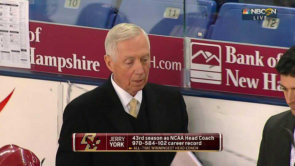
As is fairly typical, the first stoppage of play featured one of the coaches, in this case the honorable Jerry York. Very impressive career numbers. Look at how wide the numbers render. That’s also a lot of very big numbers. Why is the subtext in all caps? Perhaps its the thinner font. I love that the “highlight designator”–the little arrow designating the subtext–is one of the NBC peacock feathers.
Super strange as well is the first presence of the broadcast bug in the upper right. This screenshot is the first time in the broadcast that it appeared. Maybe someone forgot to bring it up? The NBCSN text is rendered on top of a semi-transparent black/grey gradient bar, while the LIVE text is above a translucent constant-black rounded rectangle.
Quick look at the UNH starters–note that the “FORWARDS” text is always rendered in yellow. It looked better on the BC starters graphic owing to BC’s gold secondary color.

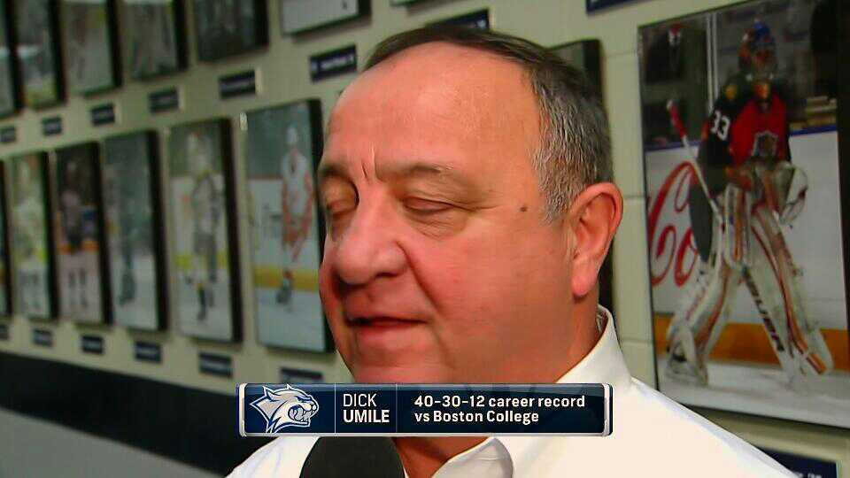
Here’s the corresponding Dick Umile graphic. I’m sadded to learned that “Umile” is pronounced “you-MILL-ee” rather than rhyming with smile.
Nice little side-insert graphic. NCAA logo is present, and the bottom bar color reflects the NCAA’s light blue color (Pantone 300 U). Also some very impressive stats.

Heading in to our first commercial break at 12:59 (the window typically opens at 16:00, so we caught 3 minutes of uninterrupted play). Note the full-width ascender and chrome bookends/bottom.

We’re back from the break, and WHAT? WHY IS THE ASCENDER NOW SMALLER? Honestly, how does this happen? The peacock is bigger, the font is bigger, and the length is shorter. I don’t claim to know a lot about how these (presumably) Vizrt graphics work, but WHY WOULD YOU HAVE BOTH THESE GRAPHICS IN YOUR PLAYOUT? Spot any other differences? OF COURSE! BC gained its rank (#17), the school logos are smaller, the bottom bar is black instead of blue, and the period/time text is smaller. Seriously why has this happened, NBCSN?

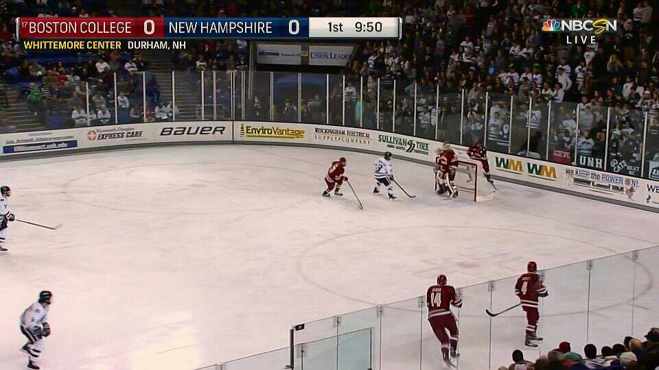
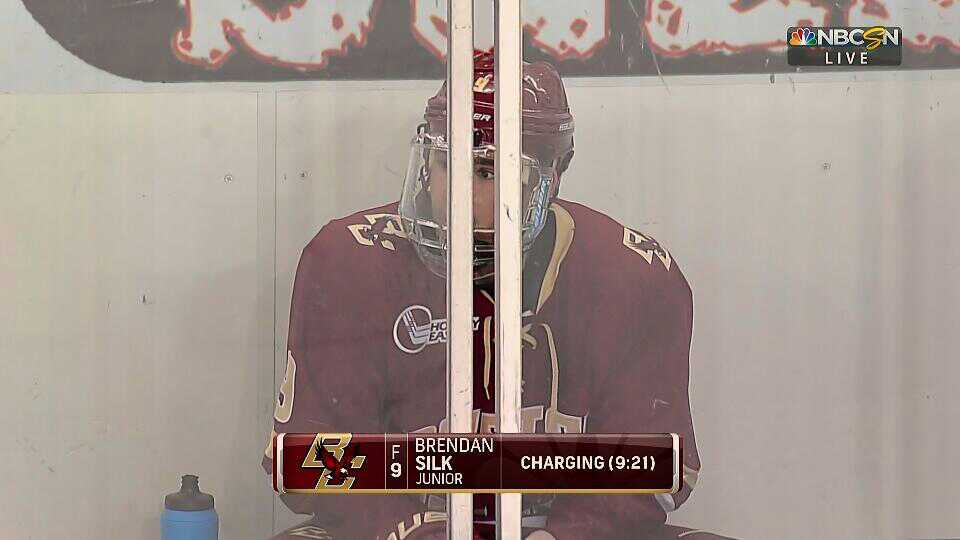
Just over 7 minutes into the period, we’re treated to our first penalty. This lower third shrinks in width to accommodate the smaller content size. Everything is caps, of course. Time of the penalty is always handy. The shot is fun, taken from a reverse angle. The Whittemore Center is unusual in that the benches are not on the same side (like RPI’s Houston Field House). The visitor and penalty boxes are on the near side of the broadcast shots, while the home and scorers booth are on the far side.

Two things here–first, let’s look at the score bug/bar. The descender noting the Power Play is the width of the school’s area. The text is centered, and rendered in ALL CAPS. Again, the bottom color is the school’s secondary. Next, the lower third. Why on earth are the percentrages and ranks rendered IN HUGE BOLD TEXT? Disappointing, because I like the way the test of the graphic is rendered. The ascender is interesting as it is dual purpose with a large void in the middle–I’m wondering if it would have looked better with dual ascenders? The name of each school is not shown, only the colors/logos are used. The order is also a strange; home team is on the bottom, which arguably makes sense, but I’d rather see the team on the power play on the top. The content is great, but again, the rank and percent are WAY TOO BOLD.

UNH’s (terrible) 9.1% powerplay failed to click, and we went commercial break. Upon return, we saw a brief highlight for an upcoming feature on NBCSN. The flat, rectangular graphics fit with the rest of the broadcast, however this look is being used on all NBCSN broadcasts nowadays.

The same break also allowed for a look at UNH alumni. A good why-should-you-care for the casual viewer who might be tuning in without a lot of college hockey knowledge. I can’t remember exactly who is in this picture aside from both van Riemsdyks, who currently play for Toronto and Chicago.
Once play resumed, we were treated to the location of this game dangling from the score bug/bar.

Commentators too, for good measure. The yellow label text is now on the right, and an ampersand is used. Both weird.
Here’s a look at a non-stat player lower third. Appropriate use of bolding and all caps (if you have to use all caps, this is an okay way to do it).
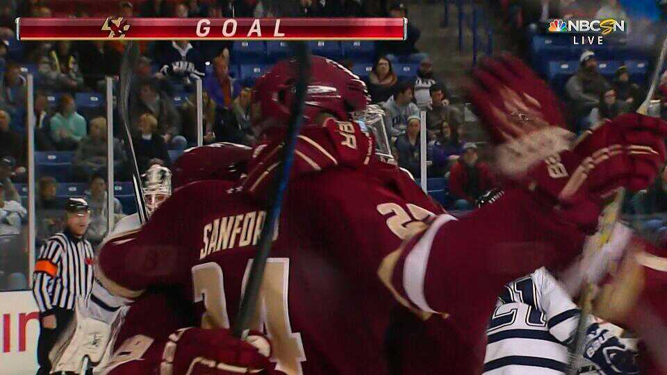
BC unsurprisingly lit the lamp first. The entire score bug/bar lit up in celebration, and continued to pulse after reverting to normal form.

Your goal scorer, #24 Zach Sanford!
BC has only scored 6 times in the first period? Really? Regardless, a good look at a factoid dangler.
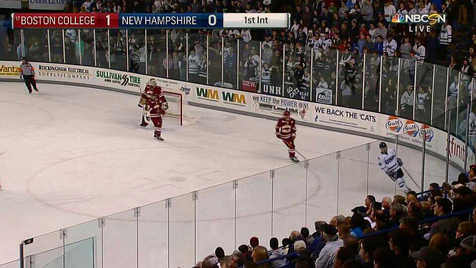
As the period ends, the clock area is set to “1st Int”. Woohoo for mixed case!

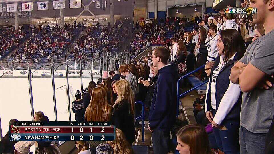
Our preview of the intermission report uses the older-style snow-effect-from-the-bottom. I really like the use of hockey boards as a backdrop.

The final score lower third reverts to full-width ascender. Something about the spacing/padding around the score numbers doesn’t work for me. There’s a lot of empty space on the bottom bar, too.

Here we go! The US Bank Sports Report! This graphic is clearly the result of a first year college student’s 3D graphics course homework. Ugh, terrible normals.
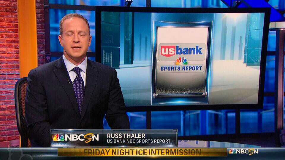
Once again, the caught-blinking-in-a-Reilly-screenshot strikes again. The whole intermission report should remind you what the normal NBCSN graphics look like. The bottom line / score crawl also makes an appearance, and I reflect on how wonderful it is that NBCSN chooses not to show a bottom bar during play (I’M LOOKING AT YOU, ESPN).

Highlights from around the College Hockey scene. This clip from Miami (of Ohio) is presented in Glorious Standard Definition. Their scorebug admittedly doesn’t look terrible.
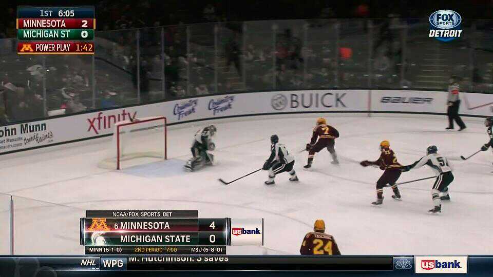
Next, a Fox Sports tilt. I’ve quite enjoyed the development of Fox Sports’ new graphics package, which debuted on MLB opening day 2014. Great use of the school’s colors in a compact scorebox.
Quick look at the graphic used when transitioning to a highlight package.

Ah, BTN’s graphics. Their hockey score bug has changed a bit from last season, perhaps I’ll highlight the changes in a later post. Heavily stylized with both a slant and a curve in opposite corners, it’s a good look.
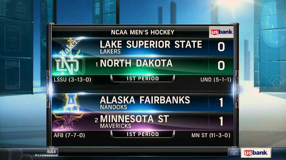
Here’s a look at the out-of-town scores, where the LSSU Lakers are playing the North Dakota _______.
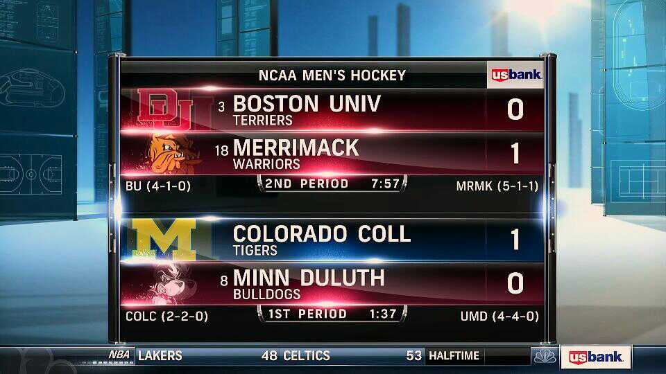
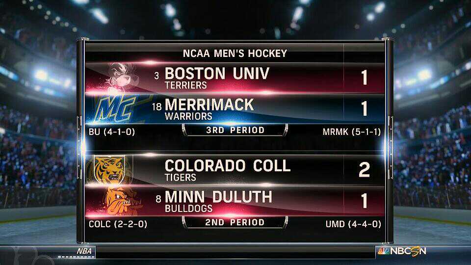
Where to begin. At least the header reflects that indeed, NCAA Men’s Hockey is being played. Every single team row here is wrong. And many in multiple ways. Starting from the top: BU has been given DU’s logo. DU is not one of the teams in this graphic. Colorado College is, however. Sure, both teams are located in Denver, but they’re over an hour apart. I also don’t like the abbreviation of UNIV, when it looks to me like UNIVERSITY should fit. Same goes for COLL/COLLEGE. Next line, it’s Merrimack. That logo isn’t a warrior, it’s a bulldog. The color is… probably Duluth’s color based on the way this graphic is messed up. A Duluth bulldog, to be exact. Colorado College’s line features… the Michigan M? The background color might be Merrimack’s blue, but it’s probably not. The last team row features the BU Terriers logo. Aside from the logo/team combos seemingly being swapped, there seems to have been two complete mis-identifications–Michigan instead of Merrimack, and DU instead of Colorado College. Further, the home/away teams aren’t right, even if it was a simple swap. I don’t even.

The intermission report also covered the NHL, but I don’t really care. Here’s an interesting caption.
Back to the Whittemore center for a brief stats rundown. Tons of stuff going on here. A white glow emanating from the logos. Some… rivet holes along the sides? Team names extending beyond the graphic with a cool ribbon effect. EVERYTHING IN ALL CAPS. And the ever present NBC peacock in the background. The graphic is in front of a live shot from the “beauty” cam high in the near (I think?) right corner.

Coming back from the intermission, it’s the score lower third again, with non-full-width ascender. The color bars behind the team are also a bit lighter than the going-into-commercial-break variant. Once again, I don’t understand why this is happening.
Also not entirely sure what this a shot of. Presumably a holiday ribbon on… something… Is that what a Wildcat looks like?

Some nice graphics to intro the BC highlit reel from the 1st period.

And this was the transition used to bring us back to the action.

Before the puck dropped for the 2nd period, it was time for more stats! Demko is perfect through 20 minutes.

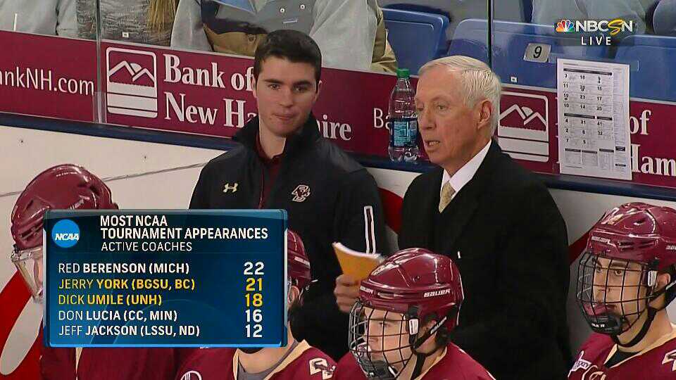
Basically, BC has a very good program. I like the use of the NHL logos here, but once again the ROUND and YEAR text is way too bold/big, and there’s a lot of negative space below the header and the names of the players. The chrome bookends on this graphic are not full-height, they reveal a bit of school primary color on the top and bottom. York’s assistant coach could easily be a 3rd of his age. Not sure the Dasani water behind them fulfills the term’s of the (presumed) Gatorade bench sponsorship.

Here’s a look at a stats dangler showing off the total shot count. School secondary colors adorn the left and right ends. I like how the graphic only extends across the width of the schools.

Sure, have some 2nd period shots too!

While we’re talking about shots, why not have them in lower 3rd format, too! The vertical alignment of the table rows here is awkward, New Hampshire is way too close to the bottom.

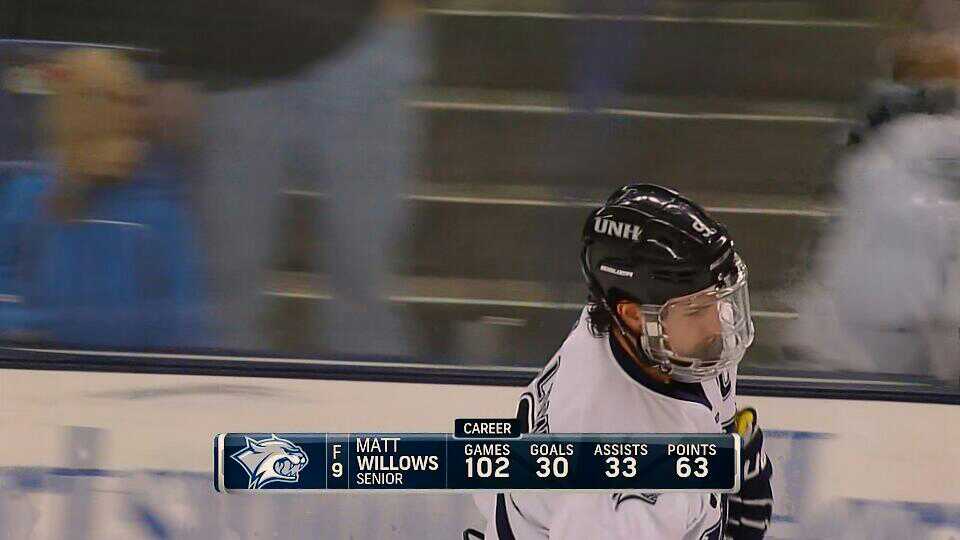
Here’s a player spotlight lower 3rd featuring Games, Goals, Assists, and +/-. The player’s total points are left as an exercise for the viewer. It’s strange that the format of this graphic differs from the player lower third featured earlier, which did include total points scored.
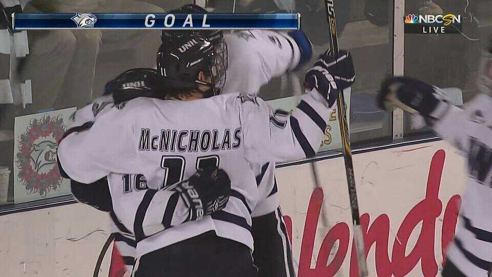
UNH scored a goal to tie the game at 1! The score bar looks better in UNH Blue than it does in BU Scarlet.
I don’t understand.
Not great composition on this penalty box shot. The eye between the door frame is a bit creepy looking. There appears to be some text on fire behind the player as well.

Powerplay stats presented via descender. These are full-width and rather informative. After the stats had time to sink-in, the graphic nicely transitioned back to just showing the powerplay time.

Apparently fish guy was cool enough that he got featured again in this to-commercial-break bump shot.
UNH’s 9.5% (coming into the night) power play has yet to produce a result, as this stat line reminds us. BC should be careful to avoid division-by-zero errors.
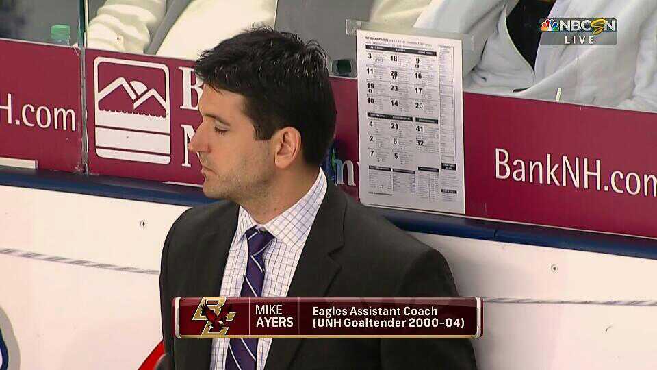
Oooh, some inter-team intrigue! Mike Ayers is apparently a UNH turncoat. Caught-while-blinking strikes again.

We already saw a similar screenshot on the first BC goal, but I like the mid-removing-helmet freezeframe. Lots of UNH players playing with a fishbowl style shield.

If you thought the ice during play wasn’t red enough, get a load of the goal overhead! The thing is bizarrely white balanced, and the camera is hung off-kilter. The PiP scoreboard is a nice touch.

There are a lot of officials wearing their headpieces in curious ways in this shot.
Here’s a correction to the earlier out of town scores panel. Can you spot all the differences?

Altitude Sports changed their score bug for the 2014-15 NHL season. I haven’t had a chance to see one of their broadcasts yet, but I hope to cover them at a future date.
I caught the 2nd period stats graphic mid-animation in this screenshot. Kind of weird to see what hasn’t appeared yet.

UNH fans used on the bump-shot back to the 3rd period after intermission. I love this stats graphic that breaks things down by period. Just have to fix the vertical alignment of the text in the bottom row…
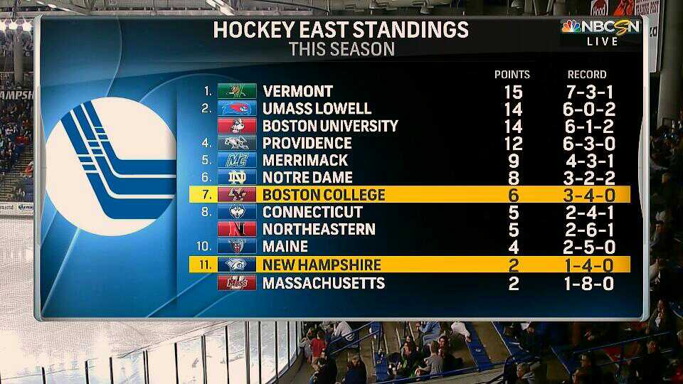
Here we go, our first look at something Hockey East related! Not a great season for either of the participating teams. Strange circular/ellipsis things are extending out of the bookends. I like the strong edge/shadow used to separate the Hockey East logo from the content on the left. Highlighting of the teams involved is a good touch as well.

Pretty sure this shot is of Jerry York reacting to the graphics on the screen. A 2.5% power play isn’t very good. I assume most of the last 10 games have been in-conference too, which as we saw from the last graphic isn’t going great for BC. Guess they miss Johnny Gaudreau a bit.

TIME FOR AN IN-GAME WORD FROM OUR SPONSOR.
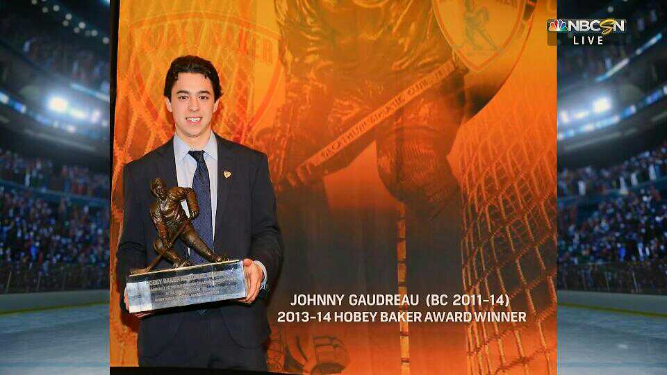
Speaking of Mr. Gaudreau, the SUBWAY ™ Fresh Take is apparently a still of shot of Johnny Football Hockey holding the Heisman Hobey Baker trophy.

Apparently there’s another Gaudreau playing for the Eagles! I did not realize there were two, and apparently Matthew is 15 months younger.

Some more stats via dangler, this time “Chances”.

And blocked shots (which is actually a real stat).

Coach split screen! This would have worked much better if the puck was being dropped on the other end of the ice…

Blocked Shots can be presented via lower third too.
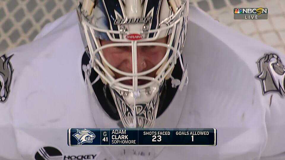
Up close and personal with Adam Clark. Not entirely sure where this camera is; could be the near-high-right beauty shot?

Why is this a tracked stat? Regardless, nice graphic. Last year, BC failed to with the National Championship in an even numbered year for the first time since 2006.
I think this is the first time that the goal was announced via dangler? If NBC used this earlier I missed it. Per earlier graphics, the “Last Goal:” should probably be in yellow.

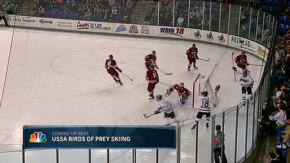
The scorebug dangler fulfills a lot of tasks, in this case hyping the fact that coming up next is USSA Birds of Prey! Now what, pray tell, is a USSA Birds of Prey? I racked my brain, trying to come up with a good answer. Birds of Prey… well I know that prior to being NBCSN, the channel was the Versus network, and that prior to that, it was OLN, the Outdoor Life Network, which feature a wide range of hunting/nature programs that still persist to this day on NBCSN. But do people really hunt birds of prey? Perhaps it’s a documentary. But what of the USSA? United States Shooting Association? What other “SA” organizations are there… what if we ditch the “Birds of Prey” aspect… United States Speed Skating Association?

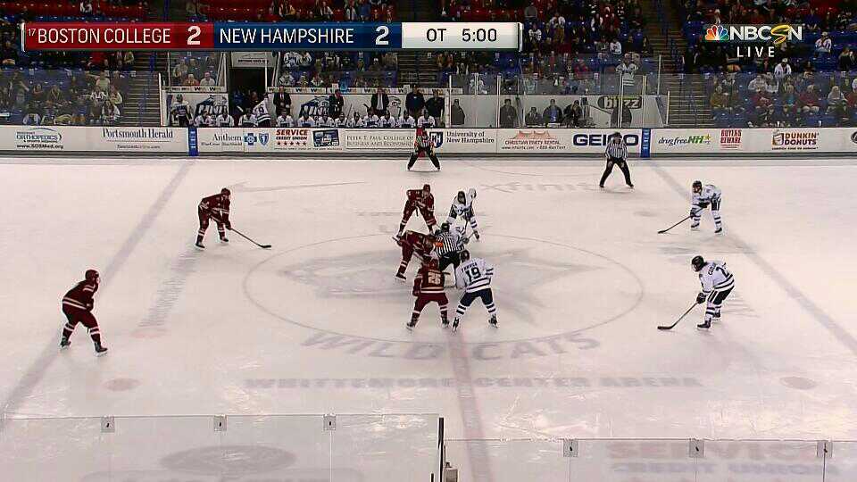
To the delight of the viewer, this matchup is headed to overtime. “End Reg,” the score bug/bar announces. BONUS HOCKEY!
Here’s another derivation of the “X by Period” graphic. Similar to a baseball linescore. This camera guy seems pretty high up in the stands.
BONUS HOCKEY.

BONUS… TIMEOUT? Good to know that the scorebar can cover this circumstance.

Tomorrow features even more college hockey, Maine vs. UMass Lowell! I was out at a bar for this game with friends who were much more interested in watching college football. I announced my intention to ask the waitress to switch a TV over to College Hockey, and was rebuffed when I mentioned that this matchup featured #7 UMass Lowell. “What the hell is a UMass Lowell anyway?” The TV remained on the Buckeyes blowout.

Not really title related, but it’s interesting to me that “MCCOSHEN” is set in all caps, rather than using small caps for the “C” in “Mc”. Savage (on the right) is a great hockey name.

We end tied! Kiss your sister (or whatever).

Here’s your final score lower 3rd. Always good to see the coaches hugging/shaking hands.

But the broadcast isn’t over yet! Time to hype tomorrow’s events! It’s the aforementioned Maine Black Bears against the UMass Lowell Riverhawks Who-the-hell-cares, college football is on!
OOOH, OF COURSE! USSA Skiing!

Yes, naturally, the 2015 FIS Alpine World Ski Championships! Dream It, Live It, Share It! Wait, hold on, the countdown says 89 days? Then what are we watching?!?

Apparently this, sponsored by Audi.
Thanks for joining me on this roundup/breakdown of a weird new NBCSN graphics package. Stay tuned for next week, when I fail to fulfull my goal of releasing one of these breakdowns each week!